China: Through the Looking Glass
A deeper look into the 2015 met exhibition

The Met gala has become synonymous with celebrities walking down a long red carpet, best- to worst dressed lists and elaborate fashion that the general public sometimes find too avant-garde. What the general public might not take into notice is that the gala is the start of a new fashion exhibition at the Met costume institute. The Met costume institute began as the Museum of Costume Art, an independent entity formed in 1937. In 1946, it joined forces with the Metropolitan Museum of Art and with help from Vogue editor in chief and fashion icon Diana Vreeland, the museum created extraordinary exhibitions that are still being held every year.
In 2015, the exhibition was titled “China: Through the looking glass”. It was a reflection on Chinese culture and how it has been perceived by the west, hence “through the looking glass”. I think it was a great choice of subject to use for the exhibition, because we’ve seen a huge growth in China’s impact on global politics and the fashion industry. During the 1990’s China’s economy grew enormously, because of the free market that opened. That led to the population becoming wealthier because of new companies that earned a big impact on the Asian market as other countries like Vietnam and Cambodia could develop with help from China’s new wealth. That created a new consumer of luxury fashion since the population got wealthier and larger, which meant that luxury houses like Hermès, Dior, Chanel and Louis Vuitton opened stores around China and today most of the big luxury brands have more stores in China than in any other country. Therefore I think that this exhibition was right in time, because the Chinese are one of the largest, if not the largest consumer group of luxury items, which has led to an impact on fashion and the fashion industry like never before.
As much as the exhibition is right in its time with China’s grip on the world it is also a celebration and reflection of Chinese aesthetics and their impact. Most people have heard about the silk road, a trading route connecting the East and the West. Reaching from Europe to China and making its way through the Middle east and Central Asia, this trading route created a fascination in Europe for Chinese aesthetics such as porcelain, silk, buddhism and other types of craftsmanship.
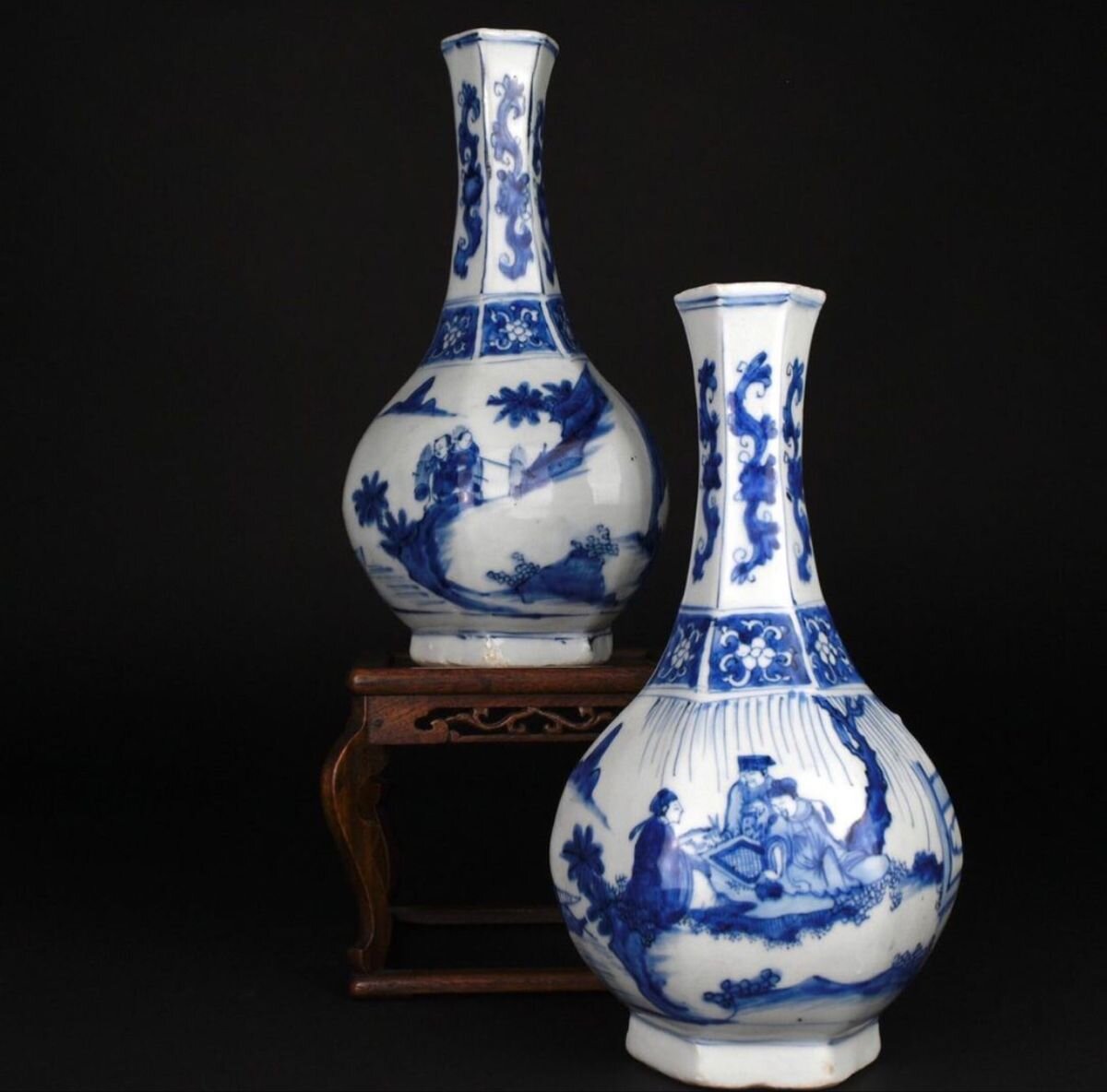

These materials were exotic in Europe, which led to a high price tag and are therefore seen as some of the earliest examples of luxury items. That resulted in a fascination with the orient and China, because it was a different culture from the ones in Europe. This fascination still exists, because the silk road lived on from 200 bc to the 19th century, because of colonialism which meant that these cultural expressions became available to the general public, because the trading developed with new technology like shipping and railway.
However, the picture of China has changed. That’s the reason why this exhibition explores three different periods of Chinese history. Imperial China, nationalist China and the People’s Republic of China. Designers tend to look more towards imperial China, because of the lavish colors and embroideries, but also for the imperial robe.

The imperial robe is a garment that radiates wealth and power and was worn by the empresses during imperial China. They are embellished with twelve symbols that are virtues of the emperor, which usually were symbols that we normally associate with China, like a dragon for example. The style of the garment became popularised in the 1930’s, because that was when surrealism became popularised with artists like Salvador Dali and designers like Elsa Schiaparelli. The art was an expression of the imagination and artists often drew inspiration from the orient which was a product of colonialism and because of that the fashion became influenced by Chinese aesthetics and the image the West had of the East.

Designers like John Galliano for Dior have explored these aesthetics in their haute couture, because of the rich craftsmanship in China, which suits well for haute couture because it is the most prestigious form of clothing manufacturing.
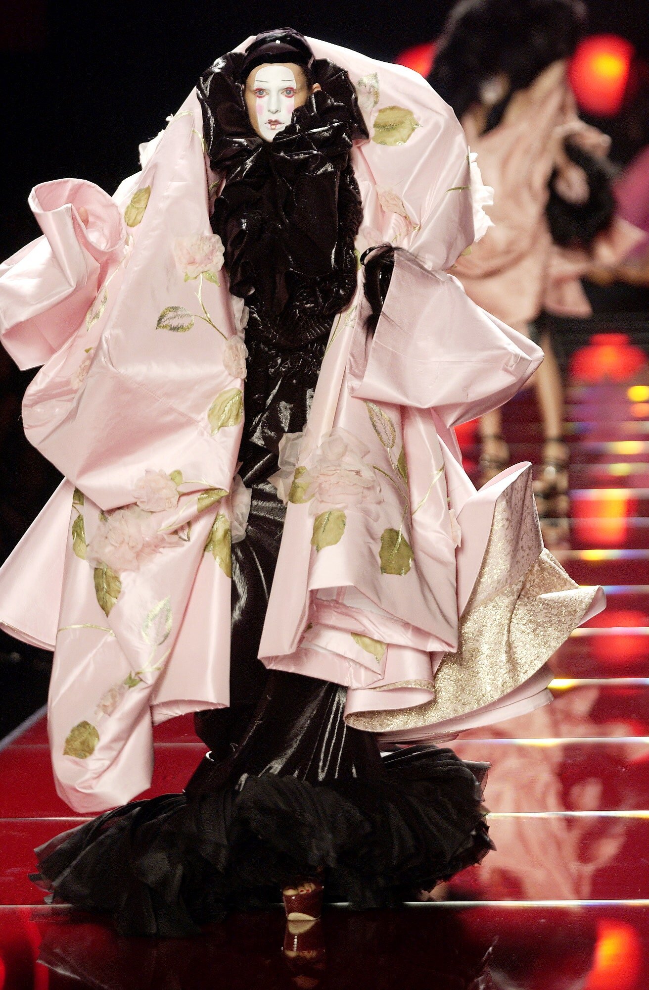
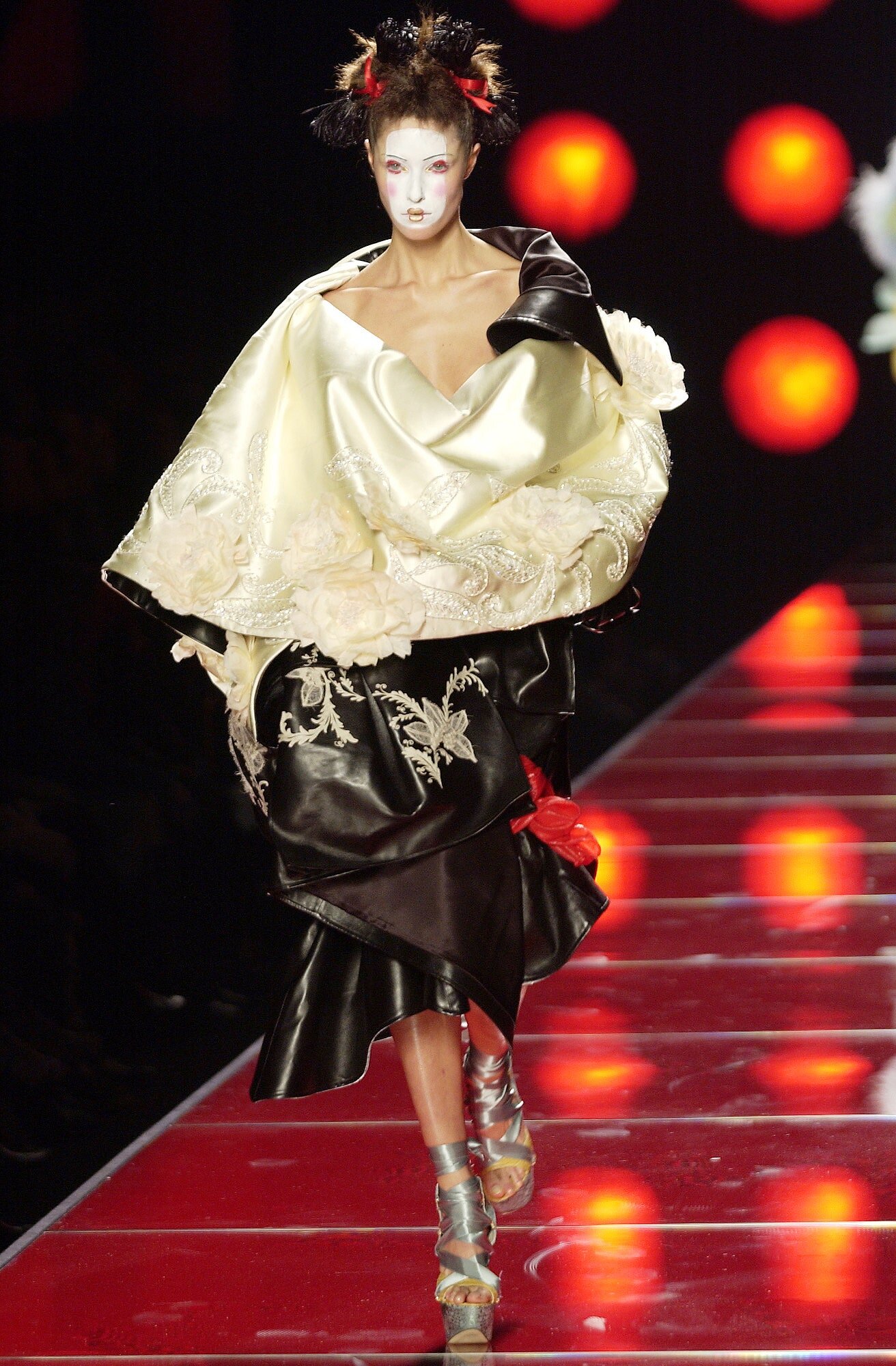
These dresses from Dior spring/summer 2003 haute couture collection explores the decadence and extravagance of Chinese opera. The decadence and avant-garde costumes were a perfect match with Dior and John Galliano in the early 2000’s who’s collections were more often than not decadent. The opera’s position in society came to an end during the cultural revolution, because it was perceived to be classicist by Mao Zedong and the red guards who established the People’s Republic of China.
While designers look for inspiration from different cultures and some of the countries where these cultures are found are among the world’s most powerful like China, the topic of cultural appropriation still needs to be discussed. Europe’s obsession with the orient has imprinted on its history, because the desire for minerals, materials and exotic objects have led to imperialism and colonialism, which has taken people’s lives and made languages go extinct, for example. In most of these cases the impact of colonialism has been large enough to make these countries struggle with corruption and poverty even today. Because of that, there is a reason as to why designers should be careful with what they’re referencing and taking inspiration from. Because it is unethical if you are selling a garment worth more than a thousand dollars and in some cases above a hundred thousand dollars, that is inspired by traditional clothing from a country and a culture that has been colonised, oppressed and might even be one of the world’s poorest countries today.
While most of us think about Chinese aesthetics as objects and symbols from the imperial era, the People’s Republic has also had a large impact. Post cultural revolution, a uniform was established by Mao Zedong, “the Mao suit”.

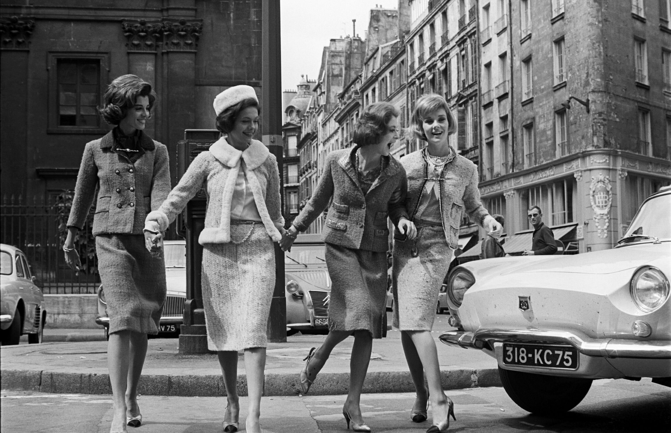
It symbolized unity, equality and utopia, because everybody wore the same clothes, which led to nobody being superior to the other, aesthetically. Designers have explored this field too, whether it’s Chanel’s classic suits or Jil Sander’s monochromatic minimalist collections, they both have a distinct expression in their clothes. That leads to having a certain consumer, because the expression appeals to a group of society. For example, Chanel’s suits tend to appeal to rich eldrely women, because it gives an impression of wealth and sophistication which is how these women want to be perceived.
The Mao suit’s legacy in China is interesting, because although the communist party remains and all industries and companies of a big size are controlled by the government, China’s fashion scene is blooming and individual expressions of style are very visible, unlike it was during Mao’s regime.

Street style photo taken by vogue runway during Shanghai fashion week ss21
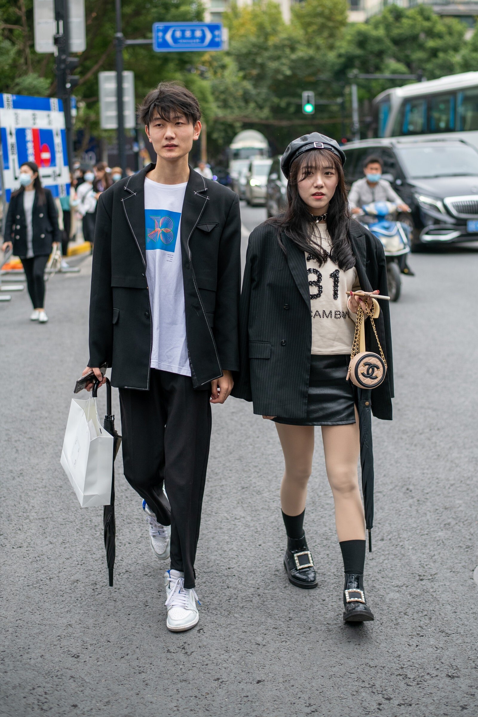
Street style photo taken by vogue runway during Shanghai fashion week ss21
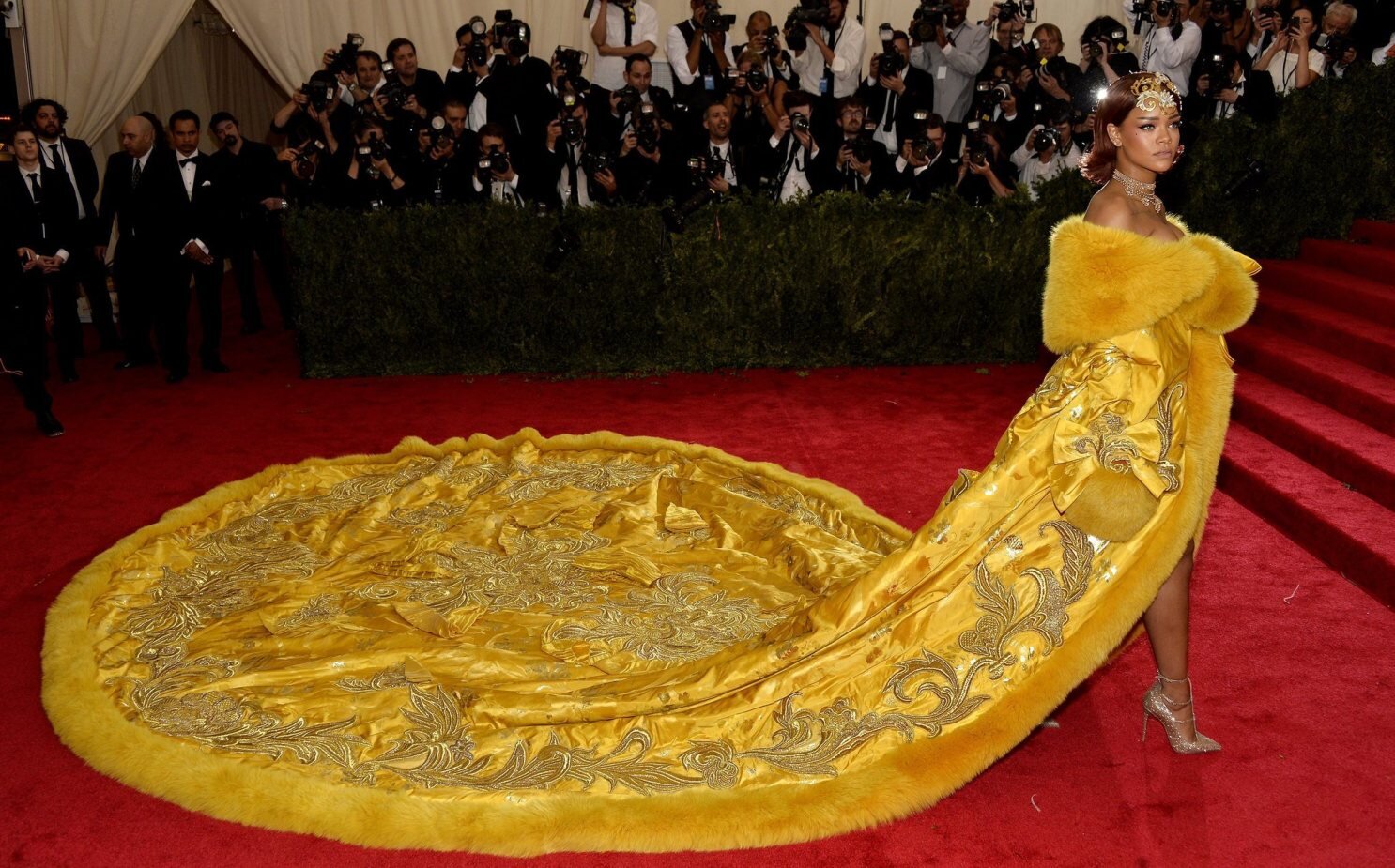
The difference is that Chinese designers tend to look for inspiration from China rather than elsewhere, which makes me draw parallels to China’s position in the world currently and it’s current rising nationalism, which is something we have seen in other countries where both nationalism and fashion are blooming, for example Russia. The russian fashion scene has been led by designer Gosha Rubchinskiy who has been using cyrillic letters and soviet sportswear as inspiration for his collections. A Chinese designer who is an example for looking back at her country’s past is Guo Pei who was featured in the exhibition “China: Through the Looking Glass” and also made the dress Rihanna wore to the Met gala that same year.

As a conclusion, in a time where China’s grip on the world gets tighter, this was an exhibition that cooperated well with its time, because the gap between the West and the East seems to only get smaller and the cultures that have been called exotic might not be as far away as we think. At the same time there are still cultural differences that are large, both in the past and the present, but if they will be erased in the future, only time will tell.
Peter Do; designer portrait and SS21 review
Since the coronavirus outbreak, there has been a question hanging in the air. How are the young emerging designers going to be hit by this pandemic? One to not stray away from his bright path is the Vietnamese/American designer Peter Do, who’s name has been on everybody’s lips since he showed his fall 2020 collection in New York, earlier in March this year.
Peter Do was the winner of the 2014 LVMH Graduates Prize. The prize given by fashion conglomerate LVMH, who owns brands such as Louis Vuitton, Dior and Moët, is open to students studying design at fashion schools. The price is a 100 000 euros grant and an opportunity to work as part of the design team at an LVMH brand for one year. After Do won he started working under Phoebe Philo at Céline, which is visible in his collection as they seem to have similar opinions and philosophies about what fashion should be.
Peter Do is an interesting designer. Similar to the legendary Belgian designer Martin Margiela, his mysterious persona has led to curiosity for his label. He dislikes to show his face and the only way for the public to recognize him is by his tattoo, a line stretching from his left ear down to his hand, which to me is the definition of a designer signature. Do also likes to incorporate his tattoo into his designs. The tattoo was seen as a juxtaposing colored line on turtleneck sweaters in his fall 2020 collection.


The line was also prevalent in his spring summer 2021 collection, for example in look 7 where it was placed on the sleeve of a shirt. This type of design signature is a smart move to establish your brand as people tend to notice that it’s your design due to the signature.

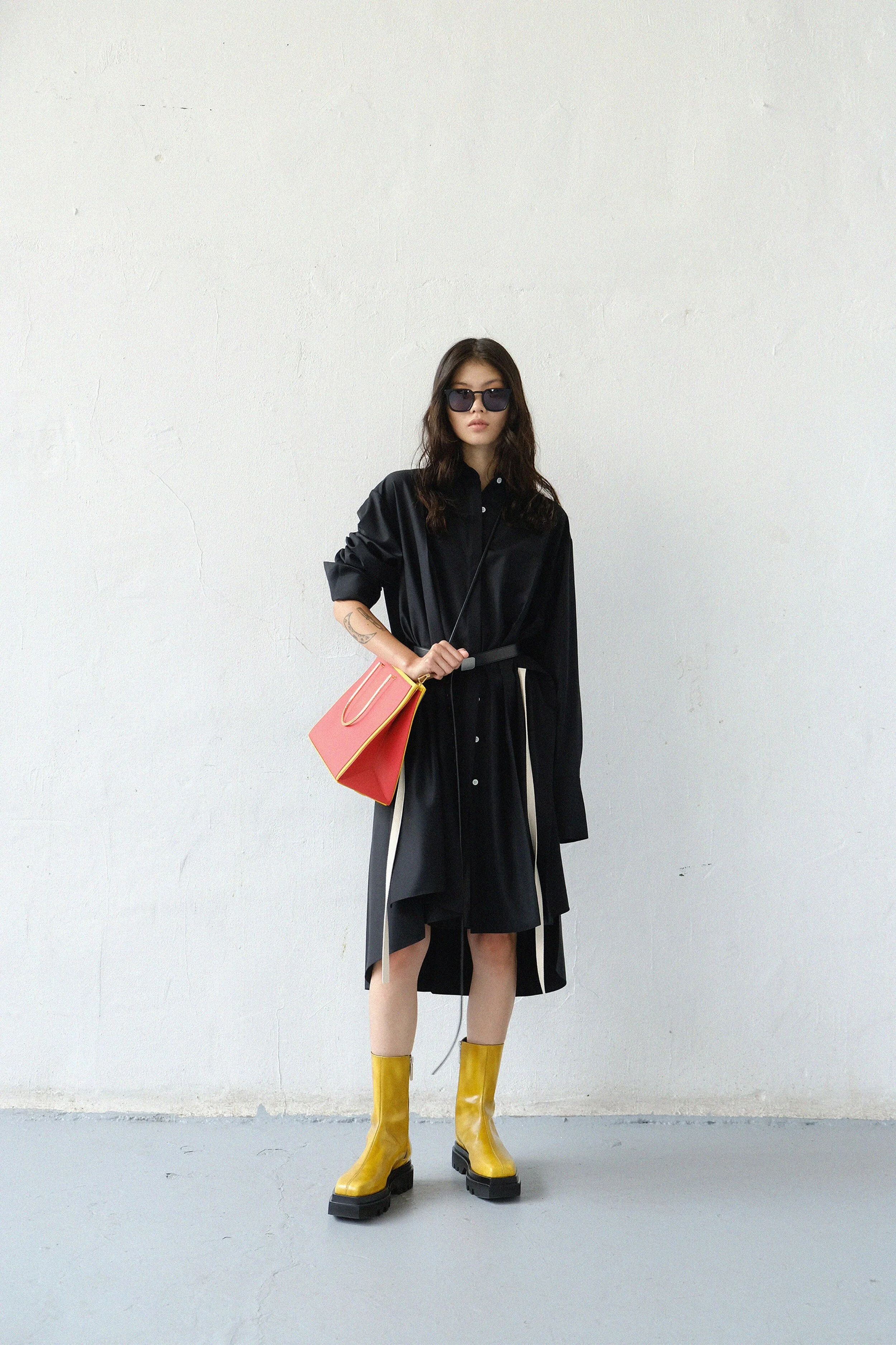
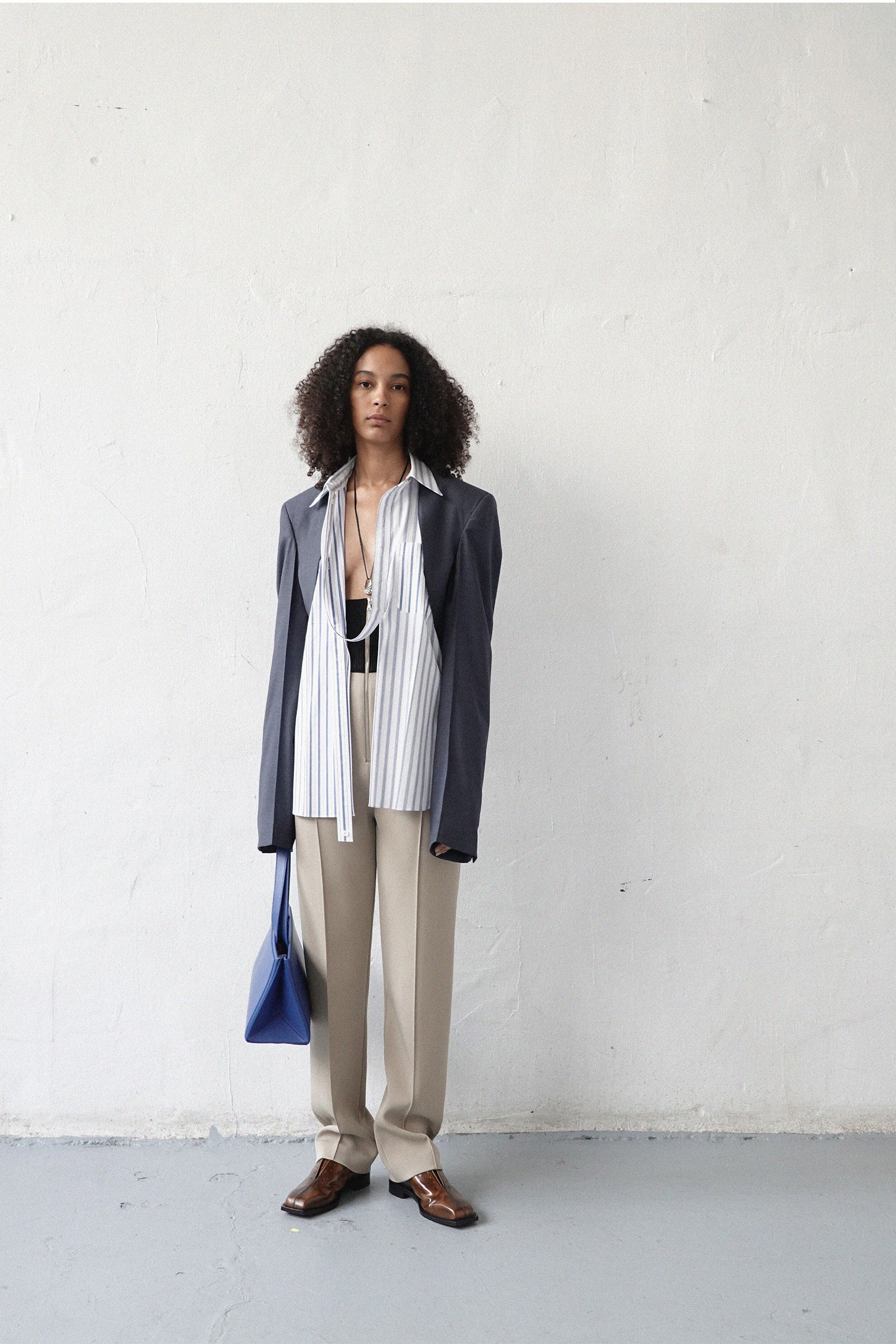
Do’s design process and aesthetic is very distinct. He has in past interviews said that he is obsessed with menswear, particularly the tailoring and structure of menswear garments. What he does is that he takes very feminine garments and adds menswear details such as sharp shoulders or visible hems. Another reason for his obsession with menswear is the fact that men buy clothes more seldom than women and do not usually buy into trends as much as women do. The philosophy of simplifying fashion permeates the brand’s DNA, because there is a big focus on utility and wearability. Although wearable and utilitarian, Peter Do’s designs are not easy. They are made with an extremely high level of craftsmanship and complicated constructions and there is always a thought behind every design detail. For example, there are skirts and dresses that have pockets which you wouldn’t expect, because of the materials they’re made of.

Fall/Winter 2020
Another example of unique functional design is the fact that Peter, while studying at the Fashion Institute Of Technology, developed his own fabric called Spacer. Do has said that he took a cotton cloth material used a lot in aviation and construction working and then made it thinner to be more suitable for clothing. The material is similar to organza except it’s more stiff and doesn’t wrinkle, which organza is infamous for. That’s another very good example of how Do makes wearable and utilitarian clothes while still having an extremely high standard of innovation and quality.

Fall/Winter 2020, skirt and pants made of the spacer fabric
Now, let’s discuss the spring/summer 2021 collection. The collection fits right with the time we live in. His signature knitwear matched with loosely fitted pants make perfect outfits during a quarantine.
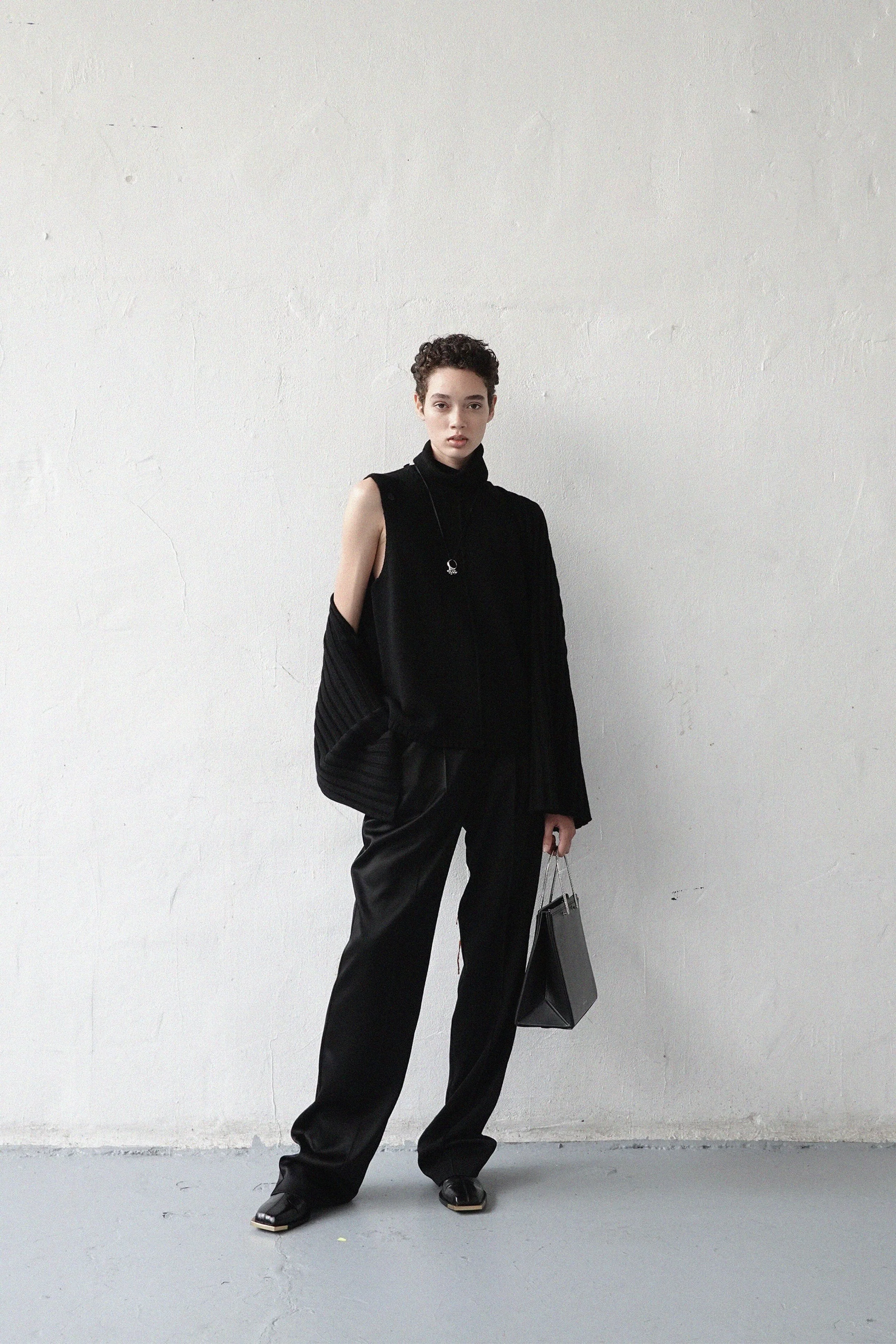
We also see the knitwear deconstructed to make cardigans and sleeveless turtlenecks which showcases the brand’s utilitarian aspect. The knitwear also helps him establish his brand, because it has become a signature piece, which as previously stated, is a key to make people recognize you and your trademark.
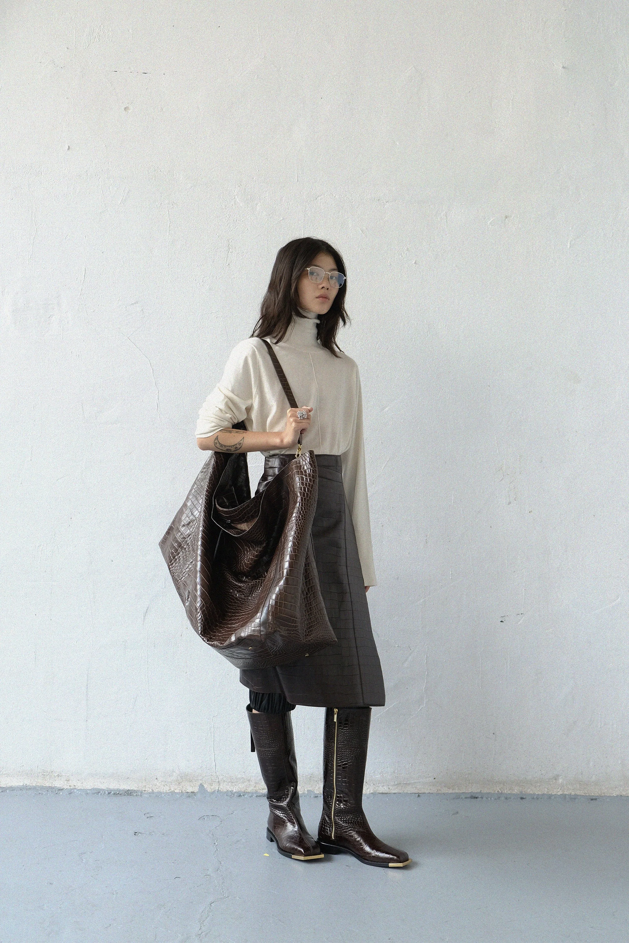
While sticking to his signature knitwear he added new styling options to it, such as skirts with pockets made of faux crocodile embossed leather.
Maybe not the most revolutionary design idea we’ve seen from Do, but the effortless shirt dresses are a smart business move as the demand for ease has grown during the pandemic and they’re styled nicely with chunky leather boots.

The deconstructed blazers felt slightly too rough.
Instead I wish he would’ve done the very well tailored blazer like the one from look 5, which would’ve made the collection more cohesive. I understand the flexibility of the design, but the styling is too much in my opinion.

In look 34 there’s also a bold piece, however the styling is much more refined as the extravagant shearling patchwork coat gets to shine on its own since it’s paired with a black cardigan in his spacer fabric and a black leather pant.

Look 18 is the one look that I think sets the tone for the collection as a whole. It’s the classic knitwear silhouette from Do in a taupe color with a matching slit skirt and thigh high boots. A monochromatic look that’s practical and comfortable yet it still catches the attention of the eye, since it has both a mixture of materials and a statement piece; the boots.

It was a beautiful collection, helping Do to establish his brand and keeping the buzz around it alive. Hopefully, we’ll see him developing his trademark pieces further as the brand grows.
Sources:
https://www.vogue.com/fashion-shows/spring-2021-ready-to-wear/peter-do
https://www.youtube.com/watch?v=hT87wzlynr8&t=679s
https://www.wmagazine.com/story/peter-do-designer-interview/
The Bushwick Birkin

A lot of people have probably heard of the famous Hermès Birkin bag. In 1981, actress, singer and muse Jane Birkin happened to sit next to the CEO of the French luxury brand Hermès on a plane. She dropped her bag and all of her binders and files fell out on the floor. Birkin and the CEO started to talk about her unpractical bag and she got to sketch her dream bag on a piece of paper and three years later Hermès launched the Birkin bag. Since then, the bag has become a mark for status and infinite wallets due to its ridiculous price which can be anywhere from 7 000 $ to 70 000 $.

An Hermès Birkin

Jane Birkin with one of her Birkins
But what does that have to do with Telfar’s shopping tote? Another important part to the urban myth about the Birkin is that it’s extremely hard to get your hands on one since it’s only up for sale to clients of the house. The Telfar bag has basically reached the same amount of cult following as the Birkin, but as the brand self says “for those who don’t have Hermès kinda coins”.
Telfar is a black owned New York based brand established in 2005 by Telfar Clemens. Born in Queens, NY to Liberian parents, Telfar created his brand as an undergraduate at Pace university. Telfar has always been marketed as a unisex brand, long before the European fashion houses started dressing men in pussy bow blouses and Asap Rocky started wearing traditional Russian head scarves.

Gucci SS16 Menswear

Asap Rocky wearing Gucci
The brand was as much a fashion brand as an art project at first and had a small clientele of people in the New York club scene. With time the brand grew and in 2014 they launched The shopping tote, also known as “The Bushwick Birkin”.

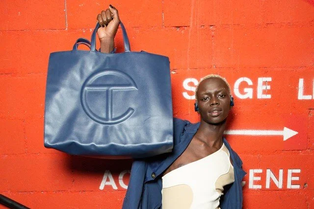
It’s a vegan leather tote that comes in a large variety of colors with the brand logo on the front. It’s available in three different sizes modeled after the sizes of the shopping bags at the department store Bloomingdales. I would call the bag simple yet effective. It has one big and open compartment which makes it user friendly. It’s also friendly to the wallet as it doesn't cost more than 260 $ which is a key to the hype.
The bag didn't become that much of a hit immediately, but after Telfar Clemens won the C.F.D.A./Vogue Fashion Fund award, he invested the prize, 400 000 $, in the production and marketing of the bag. That led to a mass psychosis for the young generation working in New York’s fashion and art scene, there for the nickname “The Bushwick Birkin” which refers to the artsy neighbourhood Bushwick in Brooklyn. The hype spread internationally and the bag became increasingly harder to get as it constantly was out of stock.

Dua Lipa wearing a yellow Telfar bag in the largest size

Bella Hadid wearing an orange Telfar bag in the smallest size
Although being compared to the waspy Hermès Birkin, Telfar has a much more democratic approach to fashion than Hermès. In August this year Telfar announced that everyone who wanted would be able to get a Bushwick Birkin. For 24 hours, you would be able to go onto the brand’s website and decide which size and color you wanted and pre order as many bags as you wanted and the brand would make one for you. This is an indicator of how young brands are changing the fashion industry. Instead of having a huge stock of bags that might not be sold, Telfar got a much more precise description of the demand for his bags and is currently making them after that demand. I ended up ordering one myself, and we who did are expected to receive our bags around the end of this year when all of the bags have been made.
On the “About” page at https://www.telfar.net/ it says “It’s not for you - it’s for everyone”, which is what I think is what describes both Telfar and the fashion brands of our young generation, which we have seen during the black lives matter movement. The big European fashion houses who each earn over billions of dollars per year have posted a black picture on instagram, while the younger brands are the ones who have donated money to organisations, while making way less money.
Sources:
https://www.newyorker.com/magazine/2020/03/16/telfar-clemens-mass-appeal
Prada menswear spring 2021 and the future of the brand
Although a menswear collection, Prada spring 2021 is full of womenswear looks as well, but putting gender labels on pieces of fabric seems pretty outdated and so does Miuccia Prada probably think too.
“As times become increasingly complex, clothes become straightforward, unostentatious, machines for living and tools for action and activity.” That’s what was written in the press note for this Prada collection. Against a grey concrete backdrop at the Fondazione Prada in Milan, models walked the runway in black and grey suits. Prada became famous in the 1990’s with its minimalist clothes made of the brand’s signature nylon, which is what Miuccia seems to dive back into.


The looks are close to Prada’s roots and original identity, an Italian family owned brand with minimalist tailoring, but we see some of the younger and more streetwear inspired designs that Prada has been doing for a couple of seasons now. They manage to blend in well with the rest of the more classic silhouettes, while still be more appealing to a younger demographic.

Shoes, knitwear and fit, everything is perfection.
This is the last collection that Miuccia will design on her own. The Belgian designer Raf Simons will join Miuccia as co-creative director at Prada. Raf is known as a menswear God who has his own cult following of fuckboys, hypebeasts and gays. He has previously been creative director at Jil Sander, Christian Dior, Calvin Klein and also designed shoes for Adidas.

Raf for Jil Sander

Raf for Dior

Raf for Calvin Klein
Raf Simons has sparked interest for a brand every time he’s been appointed as creative director and Prada, a brand that was extremely slow at adopting social media and the internet, has finally been getting more recognition for its work these past couple of seasons and hopefully we’ll see the interest in Prada increase as Raf joins the company. Last year Prada reported its first annual growth in five years. It was a 2% net revenue, according to an article in The Love Magazine (“Breaking: Miuccia Prada enlists Raf Simons”, 2020-02-23)
Throughout this Prada collection, we could see Miuccia referencing Raf Simons.


The pink coat is a reference to Simons’ last collection for Jil Sander ( https://www.vogue.com/fashion-shows/fall-2012-ready-to-wear/jil-sander/slideshow/collection#12 ) and the white tracksuit is a reference to what we might see from Prada in the future since Raf is no stranger to streetwear and overpriced sneakers.
Overall the collection was solid. It stuck to what Prada does best, while still being interesting and innovative.
Sources:
https://www.vogue.com/fashion-shows
https://www.thelovemagazine.co.uk/article/miuccia-prada-enlists-raf-simons
Fashion during a pandemic
The spring of 2020 has been a difficult time period for most of us to adjust to, but also for the fashion industry. What is the reason to put out a collection of anything else than pajamas, sweats and Birkenstock collaborations? How are department stores and physical retailing going to survive a global lockdown? And how are haute couture brands making money if they’re not able to present a noteworthy show?
Most countries took on lockdown policies in March 2020 just when fashion designers were about to launch their spring 2020 collections. Rules for lockdown came into force even prior to that in China, currently the biggest market for luxury retailing in the world. An example of the importance of the Chinese market is that an Hermès in Guangzhou, China earned about 2,7 million US dollars in one day after its reopening.
This has obviously affected the fashion industry. For example, two of the largest department stores in the United states has gone bankrupt, Neiman Marcus and Barney’s. Both companies depend heavily on physical retailing and seeing how the US has the most reported cases of the coronavirus, the prognosis for the retail giants hasn't been that good. But the online retail sector has also been affected since many countries strict policies has affected warehouses and shipment companies as well.
If we look at the collections that have been presented during the pandemic we can see that there are two different paths that designers seem to have been taking. First we have the path of “sticking to what you’re good at”. Examples of that are Saint Laurent pre fall 2020, a collection that I’ve already reviewed and Chanel resort 2021, a collection filled with tweed suits and cardigans, little black dresses, ballet flats, and flap bags which is basically everything that comes straight into my head when i think of Chanel.


The second one is the path of athleisure and comfort. Examples are Hellessy resort 2021 and Balenciaga resort 2021. Both collections showcase chunky knits, turtlenecks, flared denim and sweatpants.


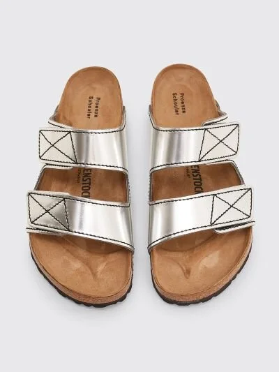
And I can only assume that collaborations like the one between Proenza Schouler and Birkenstock have increased their sales rapidly.
These are all results of designers having to adapt into the current state of the world.
And designers adapting to the current state of the world is probably not that bad. Since most brands are not able to waste their financial resources on production we might have come closer to a more responsible and eco friendly industry.
In late June, early July we saw the first ever digital haute couture week. Haute couture is simply explained a French technique of making clothes only by hand and it’s based on principles like featherwork, floral embroidery having an atelier in Paris, etc… Haute couture is the most expensive form of fashion and a dress can cost over a hundred thousand dollars. That has lead to the fact that there are only about 200 people that are able to afford haute couture pieces and most designers use Haute couture more as an act of PR than to actually sell. But seeing how the brands are not able to use fashion shows to promote their haute couture this season it seems like the death of this 300 year old craftsmanship is not too far.
But designers have become creative with their haute couture presentations this season which might keep the craft alive. Valentino showed their collection with video presentation that showcased the pieces in a circus.

These past months have been challenging for the fashion industry, but it has also lead to designers and brands thinking more outside the box and resulted in a new fashion landscape that might have its grip on the industry for a much longer period of time than we expected.
Sources:
https://tres-bien.com/birkenstock-x-proenza-schouler-arizona-silver-ss20
https://www.birkenstock.com/se/arizona-rick-owens-/arizona-rickowens-fell-0-00-u.html
https://wwd.com/runway/fall-couture-2020/paris/iris-van-herpen/review/
Jacquemus ss21 review
Simon Porte Jacquemus presented his spring 2021 collection on a field about an hour outside of Paris. It’s one of the few physical shows we’ve seen this season, with about 100 VIP guests attending. Jacquemus became a force in the fashion industry to recon with after his spring 2018 collection titled La Bomba. His brand image became clear after that collection. Slinky 90’s dresses in vibrant colors, huge straw hats, flowy skirts, ridiculously tiny bags and sandals with high heels in geometric shapes, just what you would imagine Jane Birkin or Brigitte Bardot wearing in the south of France.


La Bomba
In a fashion landscape dominated by Alessandro Michele’s Gucci and Demna Gvasalia’s Balenciaga, who’s designs had a masculine undertone, Jacquemus’ collection became revolutionary due to its romantic and feminine design that would let women be feminine. It had a huge impact on fast fashion brands as well. Jacquemus is probably the reason to why we’ve seen an overload of flowy midi skirts in stores like Other stories and Zara.
But his commercial success and impact seems to have lead him to be stuck in one vision. There is no problem with having a brand image, on the contrary, I think that is what most designers should aspire to, but the latest Jacquemus collections all look very similar. If he would have shown his two latest collections on a white backdrop, I probably wouldn't have been able to tell them apart. In fact, I think that the shows themselves have been carrying the collections and been the reason to why we remember them. From the blooming lavender field in provence of his last spring collection to the wide landscape of hay outside Paris, those are the reason to why we find the collections so majestic.
If we dissect the spring 2021 collection itself, Simon Porte Jacquemus decided to name the collection “L’amour” after a meeting with dancer Alexander Ekman who’s choreography inspired to him to celebrate love in these times of a pandemic. To me the reference seems vague or at least how it’s reflected in the collection.
The show opened with a white footlength dress with spaghetti straps and straps going across the model’s decolletage and onto the arms.

After that followed two other white looks, one mini dress and a look made of a white short sleeved shirt with a maxi skirt.


Neither of the two first looks seems to fit very well and if you watch the show you can see how the straps on the dress bounce while the model is walking. Then followed a menswear look with ceramic forks and knives sewn onto a light yellow blazer and matching pants, which I think is an interesting design choice.


Jacquemus seem to have been going for an oversized silhouette with his menswear looks, but the problem is that the looks doesn't seem to have been designed oversized, instead they just look poorly fitted
I also find a lot of the pieces over designed, for example look 38 which just leads to the garments looking weird.

There were still looks that I found nice, for example look 3, 7, 10, 18 and 20. They had interesting design aspects like the buttons of the skirts being opened which showed an asymmetrical slit. The color palette of the collection was very nice, muted oranges and yellows, black, clay and white.


I would just like to see Simon Porte Jacquemus developing his vision to make the collections more interesting and to make them stand out more on their own.
Sources:
https://www.instagram.com/p/CCvPFqaj2-A/
https://www.vogue.com/fashion-shows/spring-2021-menswear/jacquemus
Saint Laurent pre fall 2020 menswear review
The Saint Laurent pre fall 2020 menswear collection was a digital lookbook presented by creative director Anthony Vaccarello. Although a digital presentation, it was easy to paint a picture of the target demographic. The Saint Laurent customer has a diet consisting of black coffe for breakfast, celery and ice cubes for lunch and cocaine for dinner. He listens to The Velvet Underground and likes Robert Mapplethorpe's photography. Vaccarello has created a brand image and he knows his customer, which is seen in his collection and advertisement. And in the middle of a pandemic it’s probably a smart move to stick to your brand image, because your customers will stay loyal.
As for the collection itself, it drew references to Beat culture in New York, for example the looks with worn denim jeans and a well tailored jacket. The Beat culture was literary and social movement in New York during the late 1950’s and the early 1960’s. It was defined by poets like Allen Ginsberg and Jack Kerouac. Ginsberg’s poem “Howl” is said to be the starting point of the Beat movement in 1955 as its decadent and vulgar lyrics created controversy.

Vaccarello also told Vogue magazine that he was inspired by French musician Serge Gainsbourg and that it felt natural to start the design process with a pinstriped jacket with blue denim, a khaki shirt and classic mens shoes in his mind. The french musician was mostly seen in a double breasted suit which was the opening look of the show and it’s also easy to picture him in one of the many breton shirts from the collection.


Overall the collection was simple, yet effective. It catered to the classic Saint Laurent demographic, tall boys with slender legs and heroin chic looks. It also served well done tailoring and eye catching accessories such as mid-high heeled patent boots.

Sources:
https://www.vogue.com/fashion-shows/pre-fall-2020-menswear/saint-laurent
https://litteraturhistorien.se/the-beat-generation.html
https://www.pinterest.se/pin/569635052873209758/
https://www.pinterest.se/pin/469289223675462086/